Showing posts with label color. Show all posts

Wednesday, February 15, 2012

obsession : red & royal blue

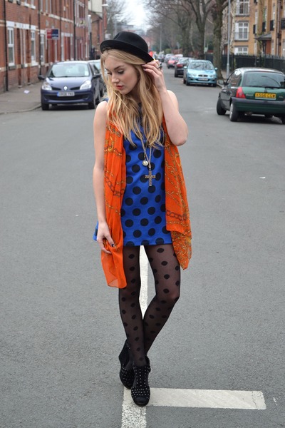
Perhaps it is from being surrounded by preppy, saturated tones at the Abercrombie design office everyday - or this bright red and royal blue plaid scarf I keep seeing - but I'm obsessed with this color combination right now.  Let's see how people are wearing it!

Source: Chictopia.com

My favorite way to see these colors together is in a print - or as solid garments worn together.  It looks best in fully saturated, rich, royal tones of these two colors - but if you aren't ready for that, try subbing in a navy for the blue, or a burgundy for the red!

Tuesday, January 10, 2012

trend : turquoise & orange

It's funny - I start a job for Hollister graphic tees, and these two colors are major for us.

 Carven, Chloe

 Nanette Lepore, Narciso Rodriguez

 Oscar de la Renta, Rag & Bone

 Rebecca Minkoff, Tribune Standard
Source: style.com

Not only do I love these two colors individually - but they are striking when worn together.  If you don't want to go full blast on this trend, pair either with neutrals (beige/nude would be my choice) to let the color shine on its own!

Tuesday, June 7, 2011

obsession : pink and blue

I've never been fond of these two colors together.  In fact, I used to hate it.  But recently they've been growing on me (too many lolita pictures maybe).  But - gasp - my new sketchbook I bought myself for New York is green, and has blue and pink drawings on it.  Who am I?


 How are the realsies doing it?


 Source: chictopia

To avoid looking like you're going to an Easter gathering or a baby shower where the gender has yet to be announced, keep things mixed: think chambray or denim with lace, masculine with feminine.  However, an all-feminine outfit can work as well, and just as wonderfully.  Pastels can be beautiful together, even head-to-toe; accessorizing with black or metals can keep the look grounded and not too "baby".  I find this look to be especially appealing on porcelain skin tones - the all-pale is just so interesting.

I will be wearing pink and blue tomorrow!

Sources: many images that are not sourced came from tumblr and could not be traced - if you know where they come from just let me know!

Sunday, April 10, 2011

obsession : mint

Having made another small step in getting over my hatred of the color green, I painted my nails a pale sea foam mint color.  It's really quite lovely, and it is making me realize a new found love for this color in general.  It teeters somewhere between green and blue, which is probably why I find it tolerable - just like chartreuse, which is close to yellow, and evergreen, which is close to a navy blue-black.  And maybe I am subliminally influenced because I love all things mint flavored - pasta with mint and peas, peppermint and chocolate ... Graeter's mint chip, before the color changed.

Badgley Mischka S11 and where it all started - Chanel F09


Costello Tagliapietra and Dennis Basso S11


Doo.Ri and Frank Tell S11


Jil Sander S11 and Juan Carlos Obando F11


Rodarte and Versace S11

 This color appears often with white for this spring season - and looks amazing when "barely there".  For fall, chocolaty reds provide a striking contrast.  Pale pinks and blacks are also interesting against mint, aquamarine, or sea foam greens.